|
 |
|
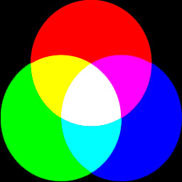
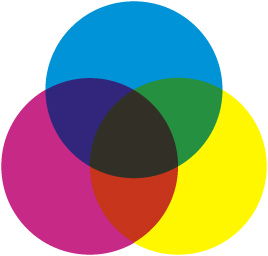
Mixing red, green and blue light produces white light -- here shown diagramatically. In practice the colors -- and white -- may not be quite so pure! |
IN THE REAL WORLD
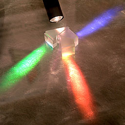
We can use this marvel of physics in reverse, to split white light into its Red, Green and Blue components. Here's a real application in action:
 |
|
The prism block of a Foveon digital camera. White light enters at the top and is split into its component red, green and blue. |
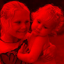
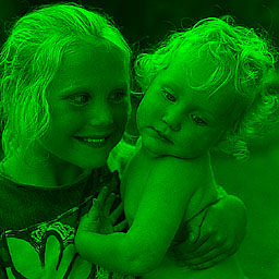
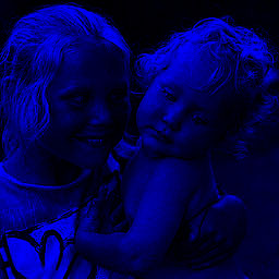
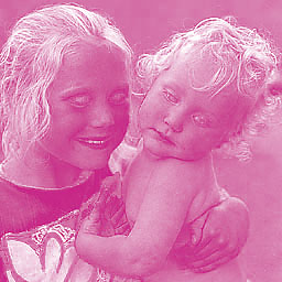
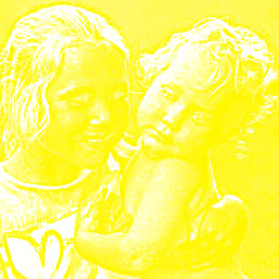
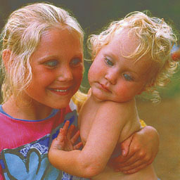
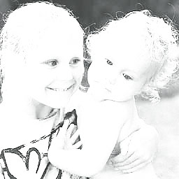
Let's return to our typical scene of a blonde girl wearing a magenta and blue T-shirt, holding a blonde baby boy.
 |
If we analyse this image in two ways -- into its components Red, Green and Blue channels and, at the same time, we use 8 bits per pixel to describe each of these three color channels in 256 tones -- this is what we get:
 |
 |
 |
SOME NUMBERS TO QUOTE
This three channel color image takes up three times as much storage space as a single channel greyscale image. The Red channel has 256 tones, as does the Green channel and as does the Blue channel. Each channel needs 8 bits to describe it -- adding up to a total of 8 + 8 + 8 = 24 bits in total. That's what's known as a 24 bit color image. Each pixel in the image can have any one of 256 tones of Red and any one of 256 tones of Green and any one of 256 tones of Blue -- all at the same time. This makes a total number of color combinations of 256 x 256 x 256 = 16,777,216 colors. That's a very impressive number of colors. Ask someone if they can name them all! You can name them all with ease: Red, Green and Blue. It's just the amounts of each which vary.
COLOR ON A MONITOR
When we display our images on a monitor screen they are displayed as minute specks of Red, Green and Blue phosphors which glow when excited by an electron beam. There are different structures to the colored elements. Depending upon the construction of the tube, there may be dots, slots or squares. A flat screen display uses different technology, but the principle is the same. Take a magnifying lens and look at your screen. Displaying our three channel color image on a monitor screen results in the image appearing in all its natural colors.
 |
|
A 'shadow mask' television screen (cathode ray tube) greatly enlarged to show the structure. All the Red, Green and Blue elements are glowing equally and at maximum. At normal viewing distance this screenful would look white. |
COLOR ON PAPER
If we want to display the image on a sheet of paper, though, the technique is somewhat different. In this case we start off not with a darkened room or tube but with a sheet of white paper, which reflects most of the light which falls on it. Onto this paper we have to deposit pigments or inks which have the effect of absorbing some of the light being reflected by the paper. For example, a pigment which appears yellow reflects only the yellow part of the white light from the paper. By using Cyan, Magenta and Yellow inks we can make most other colors:
|
+ Yellow |
+ Yellow |
+ Magenta |
 |
|
The pigment or ink colors should be bright and saturated but, in practice, they are often restricted in their range of colors -- known as "gamut" -- and do not mix to produce a good black. |
Our image is converted from R G B to C M Y for printing. This is either done consciously in the computer, using Image > Mode > CMYK Color in an application such as Adobe® Photoshop®, or behind the scenes without you even knowing about it when printing to a color printer. These are the colors which would be printed:
 |
 |
 |
 |
|
Printed in register on top of each other, the C M Y separations give an image like this one. Printed in CMY alone, the colors do not mix to produce a good black. Sure, it's 'colored', but it's not good color. |
 |
|
|
To restore the blacks, a fourth channel -- K for Key, often referred to as K for BlacK to differentiate from B for Blue -- is produced. |
This thin black channel restores neutral tones and gives the printed image body. This is a C M Y K image. The result is much closer to the original we viewed on the monitor, though it can never be a perfect match because of the different color gamuts. |

The C M Y K image has four channels, not three, and so it has a 33.3% larger file size than an R G B image file. Unless you are outputting for reprographic printing with ink on paper, chances are you'll stick to R G B for images on the web, or let the relevant printer driver convert to C M Y K as required. But, if you've stuck with me this far, at least you now understand lot more about the structure of your digital images.
Although 'point and shoot' may be all you need to know for most photography, just as with anything else, the more you know the more you are capable of understanding.
Return to the STRUCTURE OF A DIGITAL IMAGE index page
![]()
All text and photographs are Copyright © 2005-2008 by John Henshall. All rights reserved.