Greyscales and Colour charts to help you check your monitor lineup.
Right click and save these images to your desktop. Please note that they are in Indexed Color mode, for use on this website. You may wish to convert them to RGB using Adobe Photoshop. Check that all greys are neutral (same amounts of Red Green and Blue) and that the colour bars have values of 255 in the respective colours.
A small (525 x 50 pixels) double greyscale in 5% steps. Position on your desktop to check that your monitor is neutral - and to 're-calibrate' your eyes when working with images with colour casts. Mid grey is where the upper and lower squares are identical.
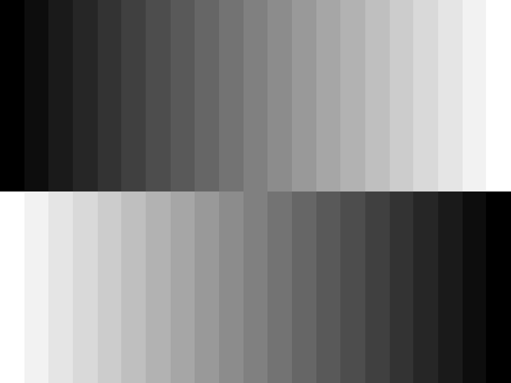
A larger (1024 x 768 pixel) double greyscale in 5% steps. Useful for displaying full screen to check the neutral tracking of monitors and digital data projectors.
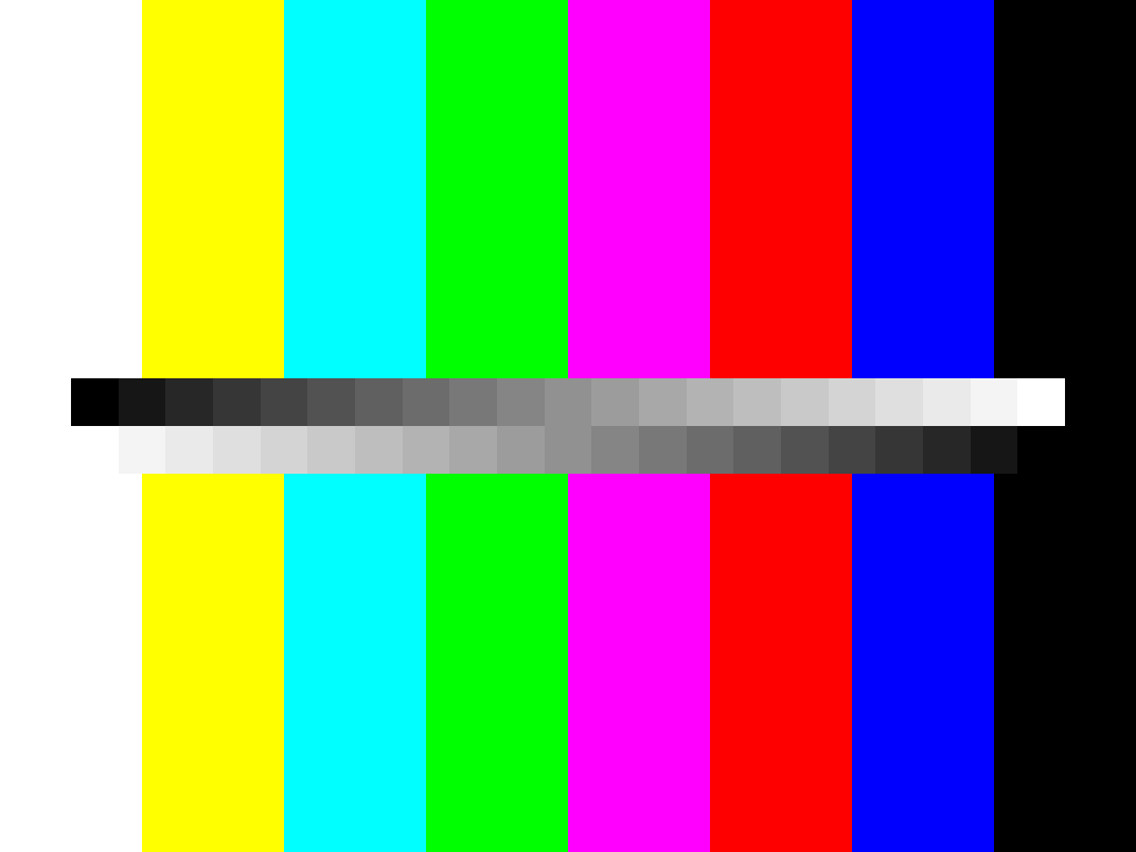
A combination of double greyscale (5% steps) and maximum saturation colour bars - the richest colours you can generate on your computer. This is a 1024 x 768 pixel version.
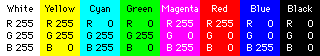
The third file combines a grey scale with electronically generated colour bars, just like the ones used in television. The saturation of the light primary colours - red, green and blue - is the maximum you can generate in the computer: level 255. The light secondary colours, which are also the pigment primaries - cyan, magenta and yellow, are also at maximum saturation. White is made up of equal and maximum amounts of all the light primary colours. Black has zero amounts of the three primaries. Here's how the colour bar colours are made up:
The colour bars are useful as one of the tests for colour printers, which convert RGB images to CMYK - Cyan, Magenta, Yellow and Black. In colour printing, Black is usually referred to as K (for "Key"), rather than B, to avoid confusion with B for Blue.
You may be surprised how dull a print of colour bars looks. Using four colour printing, blue reproduces much darker than on a cathode ray tube. Green is also on the dark side and there is little difference between magenta and red. In colour printing, Red is made by adding yellow to magenta.
All material is Copyright © JOHN HENSHALL 2005 and may only be downloaded for personal non-commercial use.